End-to-end system mapping before a single screen is drawn — APIs, org dependencies, and user journeys treated as one model.
6-milestone delivery plans. Decoupled backend dependencies. 2 months saved at AWS. Designers shipping MUI directly at Venafi.
Trust design, agentic workflow patterns, and transparency at scale — for AI products that earn confidence before they ask for it.
Customer panels replacing roadmap opinions. 12K tickets synthesized into priorities. VP-level alignment without losing the user.
30K → 275K console visitors. 58K dev hours saved on a single pivot. 0 → 300 SaaS customers. 66% friction reduction across 18 workflows. The work shows up in numbers.
Unique console visitors at AWS ECS. Was 30K at project start.
Dev hours saved by decoupling one roadmap dependency.
Enterprise customers on Venafi SaaS — launched from zero.
Console friction reduced across 18 workflows, 110 parity items.
“Ruchita ran viewing parties so our VPs could watch real users struggle. That one session did more for roadmap alignment than six months of decks.”
“She synthesized 12K customer tickets into a prioritized roadmap the entire leadership team aligned on. In one session. That’s not a designer skill — that’s executive leadership.”
Every engagement starts with a system audit — not a wireframe. I map what exists, where it breaks, and what business outcome the design must move. At AWS I produced end-to-end journey maps for 18 workflows and 110 parity items before a single new screen was proposed. The framing is the work.
I run customer panels, synthesize support tickets at scale, and host user testing viewing parties with leadership — so roadmap decisions are grounded in real behaviour, not internal assumptions. At AWS I synthesized ~12K tickets and distilled 25 customer interviews to drive 7 UX-led asks into OP1. Data doesn’t just inform the design. It wins the room.
I scope releases in milestones that ship real value and let the org learn in production. At AWS I defined 6 delivery milestones saving ~2 months of schedule under 90% team attrition. At Venafi I structured a Figma→MUI pipeline so designers shipped production components directly. Shipping frugally is not a constraint. It’s a strategy.
The most leveraged design work happens at the API layer — not the UI layer. At AWS I visualized 10+ API touchpoints to influence 2 CloudFormation templates, enabling single-click workflows engineering had previously said were impossible. At Docker I brought FE and BE teams into hi-fi reviews early to model cost tradeoffs before commitments were made.
Misalignment kills products before bad design does. I use journey maps, vision artifacts, and workshop facilitation to create a single shared model across PM, engineering, and leadership. At Docker I reduced 10 competing PRDs to 5 prioritised initiatives in a single quarter through structured empathy mapping. Alignment is a design deliverable.
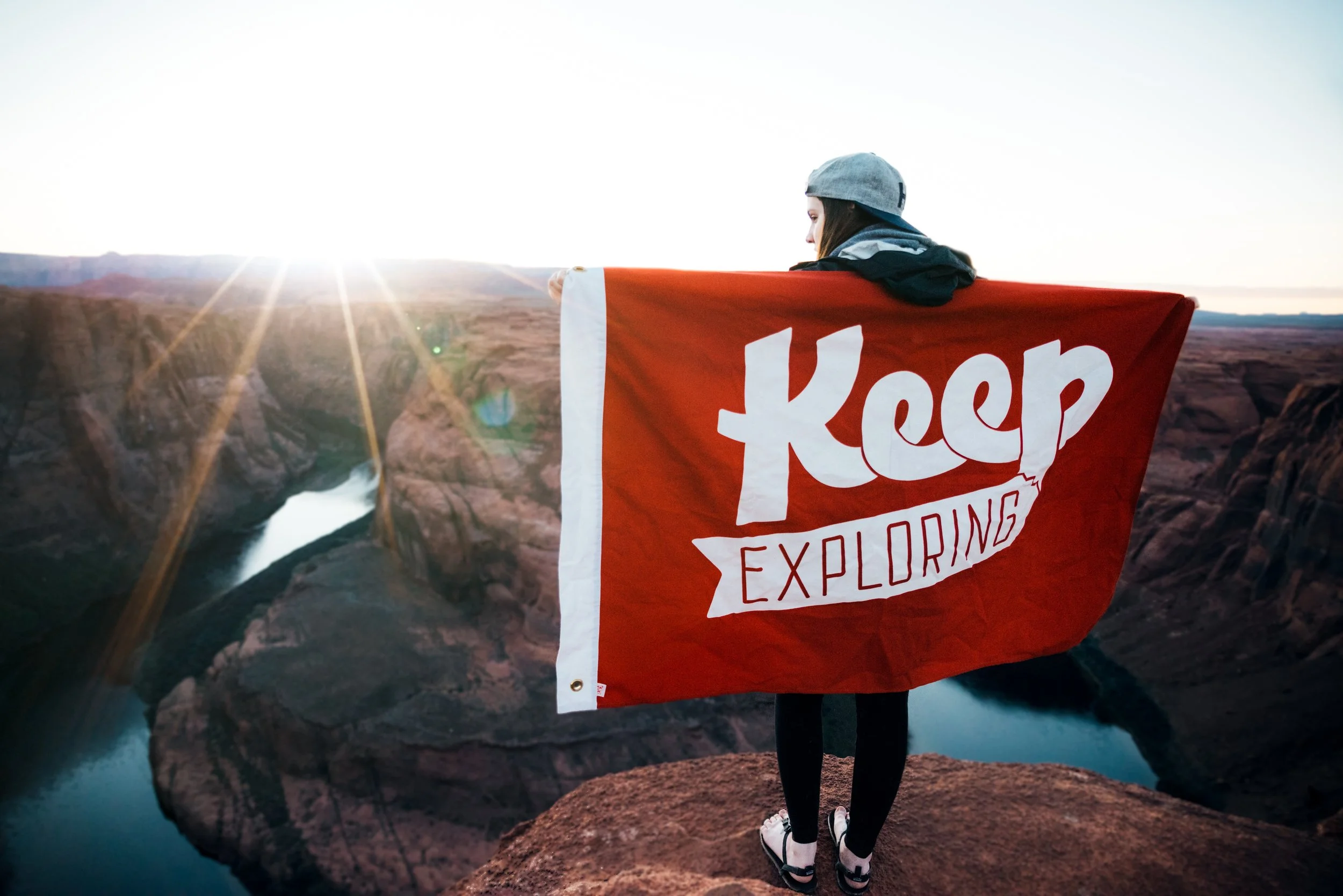
Drop - Travel anywhere like a local
Mobile design, startup bootstrapping, design for growth
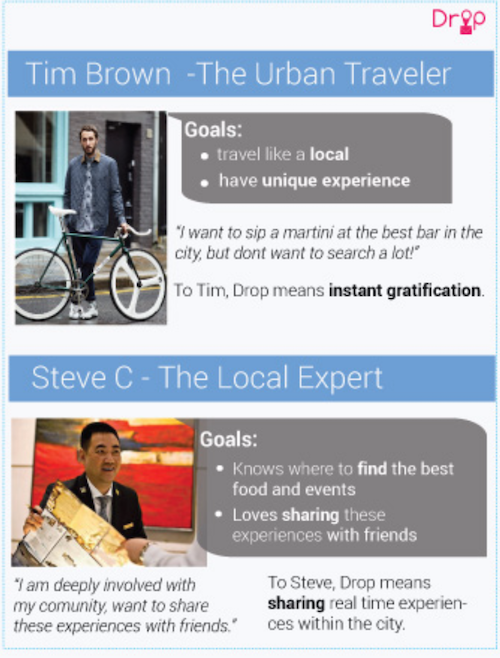
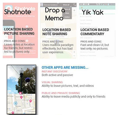
An urban traveler experiences information overload, frustration with plethora of choices, lack of authentic information, and high cost of decision making.
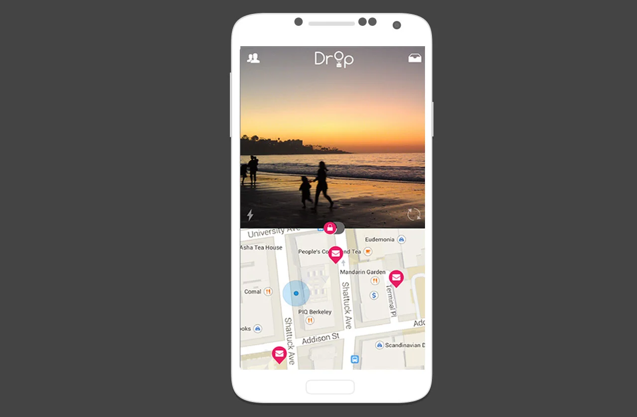
She often has to navigate through plethora of apps (Yelp to make the decision, Google Maps to find actual location, etc.) and ends up being overwhelmed by fragmented discovery process.
.
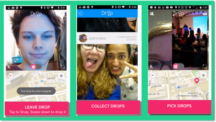
With Drop, we have redefined the art of discovery. Drop connects travelers with local experts and provides sense of spontaneity and ownership for the travelers.
For new product development, we phased our process into the following:
Phase 1: Finding product market fit
Phase 2: Wireframing and rapid prototyping
Phase 3: Iterating on visual design
To find product market fit for wearable based app, we conducted 6 contextual inquiries, usability tests for 40 participants, and performed competitive analysis for 6 competitors. The ethnographic UX research helped in understanding our user's mental model, clearly defining our problem, and creating crisp goal-oriented persona cards:
Persona based design helped in creating a clear MVP
Competitive analysis
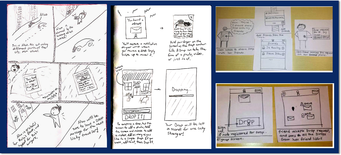
With the persona data, we rapidly collaborated on creating task analysis, storyboards, and low-fidelity sketches to define our tasks and feature sets:
Storyboards collaboration with the team
Rapid sketching based on the storyboards
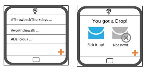
In our first design sprint, we focused on cohesive interaction design and aesthetics. Which led to our decision for using material design. But we still found Drop’s phone UI clunky to navigate, with too many screens and steps to get to the key feature of the phone — sharing. We experienced the following design challenges:
Designing for watch's small form factor
Creating seamless interactions from watch to smartphone
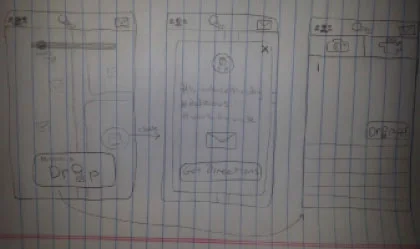
Rapid wireframing and prototyping
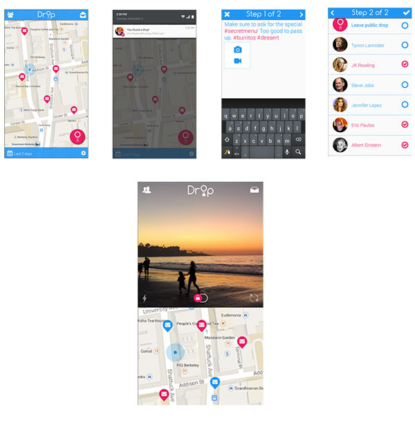
In our second major redesign, we pivoted on the functionality, opting to focus on visual media rather than text, thereby simplifying the app immensely. We also used a mode switch to help people distinguish between sharing with friends and sharing with the public, instead of complicated picking and choosing. And, we updated our privacy settings to use usernames and pictures, rather than anonymity for more accountability in public drops.
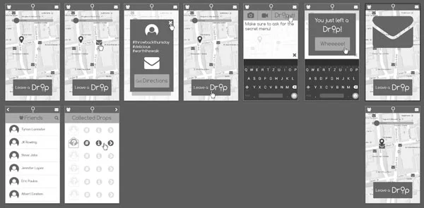
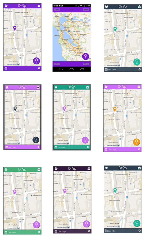
Visual design iterations
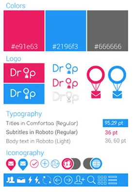
Drop style guide
Iteration made a huge difference in our visual design and interactions. Drop started out looking more like an app for navigation than one for social and sharing. It also lacked a modern design aesthetic.
We are humbled that Drop got a huge response in the Cal community. But, despite that we could not launch it as an independent product. Here are some of the learnings that went into new product development process:
Strategize early and often if you want to create both Android and iOS versions of your app to save design debt in the long run.
Avoid scope creep!